Here’s What to Know About Graphic Design Typography Terms from a Graphic Design Pro
Typography is the crown jewel of most design projects, but its language is rather… unique. Understanding graphic design typography terms and how they impact the look of your brand or project is paramount to the success of your campaign. Let’s dive into the most commonly used typography terms you may hear, and how to use them:
What is Graphic Design Typography?
Quick history lesson: typography is as old as writing, but the study of its history usually begins with Johannes Gutenberg’s invention of the printing press. For the first time ever, humans were able to mass-reproduce written material—a talent previously relegated to human scribes.
The Gutenberg printing press worked like a big stamp, using intense pressure to reliably produce entire pages of books at once. Rather than make a stamp of a single page, letters were cast individually out of lead for maximum reconfigurability. The casters, some of our earliest typographic designers, had to make decisions about how to shape each letter to appeal to the sensibilities of the increasingly literate population reading them. The factors that influenced these decisions—including audience, legibility, and impact—are what continue to influence typography today.
Okay, Butttttt, Why is Understanding Graphic Design Typography Terms Important?
Cool history lesson aside, typography is truly the crowning jewel of any design project. As elegant looking as your new cursive font might be, it won’t be much help as a body font if the curls make it indecipherable at smaller sizes. An awesome image on your billboard won’t make a difference if the text is too small to read from the highway. Understanding the terms and principles of graphic design typography will help you create designs that are both visually impactful and effective at communicating your message. This is especially critical in the digital space. Legible, well-structured text is a core part of what’s known as user experience in web design. A user-friendly website is one where people can easily read and engage with your content.
Let’s Get Cracking: Here are Graphic Design Typography Terms Eggsplained
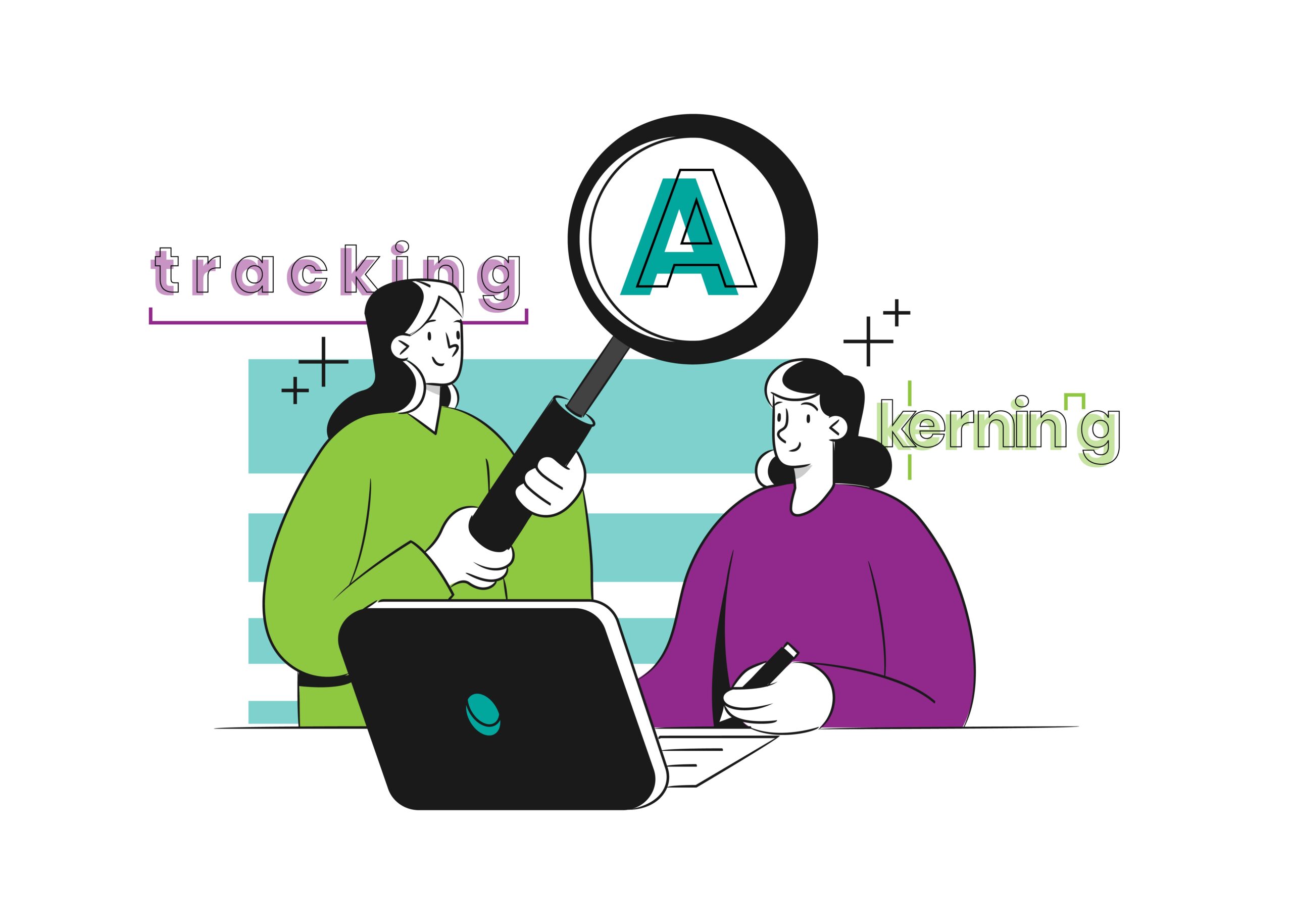
Kerning
Kerning refers to the amount of space between two individual letters. Sometimes the narrow sides of rounded or angled letters (e.g. “A”) take up less visual space, making them appear further away from each other than they are. This means they need to overlap into the personal space of adjacent letters in order to appear closer together. Most modern fonts come with kerning built in, but universal settings don’t always work universally, which is where professional designers come in.
Leading
The term leading in typography originates from the printing press (see? The history is relevant!), where plain blocks of lead were used to standardize the amount of space between lines of text. The bigger your letters, the larger your block of lead needed to be to make everything proportional and legible. Now, in the digital age, leading is a more niche graphic design typography term often referred to as “line height” or “line spacing”.
Tracking
Tracking is similar to kerning in that it references the space between letters. The difference is that it sets the amount of space between all letters in a word or line of text, rather than between two individual characters.
Hierarchy
Hierarchy refers to the visual emphasis given to sections of text in a composition. The most important content will usually be the most eye-catching in order to draw a viewer in (e.g. SALE!), while the detailed information will be smaller and easier to read up close. Larger headings and smaller body text allow readers to skim for the information they’re looking for, increasing their likelihood to engage.
Serif & Sans-Serif
Serif refers to the flourishes at the end of letters on traditional typefaces like Times New Roman or Georgia. These features were included in typography design originally to mimic the hand-done quality of books pre-press. They are still used today to add a handmade, human quality to a design. “Sans-serif” just means “without-serif”, and is a modern invention of the mid-19th century. Sans-serif fonts are characterized as being less decorative and more direct. Sans-serif fonts include Arial, Helvetica, and Calibri.
X-height & Cap-height
The X-height and Cap-height of a typeface refer to the height of a font’s letters. Cap-height refers to the height of capital letters, while x-height refers to the height of lowercase letters. These features determine the proportion of letters and how large they appear at different sizes. Choosing different fonts with similar Cap and x-heights can be a reliable way to create quality font pairings in the logo design process.
Ligature
Ligatures are letters that are combined into a single glyph. While ligatures predate the printing press (ever written two lower-case t’s that look like a capital H?), they came in handy to make typesetting more efficient. Instead of typesetting two individual letters, you could typeset one combined glyph that was already recognizable. Now, ligatures are most often used stylistically for traditional or handwritten designs.
Orphan & Widow
Two decidedly morbid graphic design typography terms, orphans and widows refer to words or lines that, for some reason, can’t live with the rest of their paragraph. These terms have become more interchangeable over the years, but most often, an “orphan” is a single word that wraps below the rest of its paragraph, and a “widow” is a sentence that wraps to the next column or page when you run out of room. Part of a professional designer’s job when typesetting long documents is to reunite them with their families for a cleaner, professional look.
Justification
Justification refers to the alignment of paragraphs on a page. Left-justified is most standard for languages like English that read left-to-right, while right-justified is used for languages like Arabic that read right-to-left. Center-justified aligns paragraphs to the center of a page, and full-justified paragraphs are aligned to the left and right sides of the page, creating even lines on your margins. Full justification uses whatever spacing is necessary between words to fill the gap, so it’s best suited for long-form written content.
Typographic Scale
Typographic scale refers to the relationship between font sizes in your design, and is a fundamental element of hierarchy. Many designs will have a “Heading 1” (abbreviated to H1), H2, H3, and so forth. Understanding the ratio between these sizes will ensure that your headings are different enough to effectively organize your content, and close enough in size to not be disharmonious. This can be especially important in your website redesign strategy to direct site visitors in the right direction. There is some math you could involve here, but mostly it just needs to make sense.
White Space
While it may not be intuitive to consider the space around text as part of a design, it’s the invisible hero of typography design. The space around the letters (kerning, leading, margins, etc.) ensures that text remains legible and consistent. If the lines of a paragraph are too close together, they become difficult to read. If the margins are too small, it becomes difficult to separate the text from the page. The space where nothing lives is arguably one of the most important parts of typography design.
Graphic Design Typography Mistakes to Avoid
Below are some of the most common mistakes people make when designing typography, and how to avoid them:
- Picking Any Old Font – Don’t just pick any font for your brand, choose one that complements your brand voice. Going for traditional and human-oriented? Go for a serif font. Modern and technological? Try a sans-serif!
- Avoid Cliche System Fonts – things like Comic Sans, Papyrus (looking at you, Avatar), or Times New Roman. While these fonts are, in theory, fine, they’re widely overused and bound to make an unprofessional impression.
- Trusting Your Monitor – Being zoomed in at 300% while designing can make you believe that people will actually be able to read the 2pt font on your new business card. Zoom out to actual size, use a mockup, or print a proof of your design before sending it to press.
Why Choose Red Egg Marketing for Your Business Marketing Needs?
In the modern design landscape, there are thousands upon thousands of fonts to choose from, and even more ways to configure them. If you’re feeling overwhelmed at the options before you, a full-service marketing agency like Red Egg has graphic design and marketing egg-sperts who can help you pick the right font for an effective and scalable brand for your business.
Not only can we help you create a brand that looks good, we also know all the important graphic design typography terms (so you don’t have to!), and we can also help you create eye-catching marketing collateral that helps turn campaigns to conversions. Our design prowess and marketing acumen earned us The Best of Mile High for Graphic Design.
Need a Hand with Your Typography? Chat With Us Eggheads
If you want a team who will nerd out about kerning and give your brand the personal touch it deserves, contact us today! Work with an award-winning marketing team on branding, UI/UX, social media, and all your other business and marketing needs.
