Epic Partners
Logo and Brand Collateral for Atlanta Real Estate Investment Firm
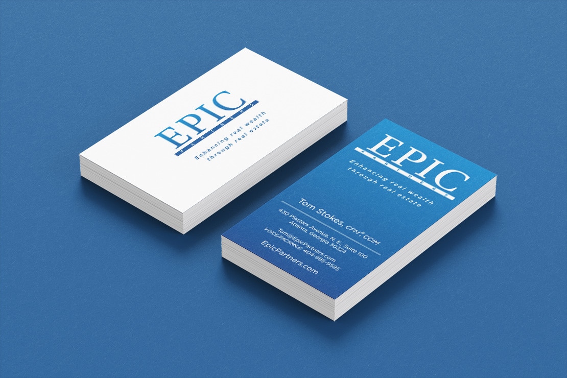
Epic Partners is an Atlanta-based real estate developer and investor in coordination with EpiCity Real Estate. They reached out to Red Egg Marketing to create a logo that felt strong and established. These signals were achieved by selecting a traditional serif font for a classic look. The word “epic” is supported by a heavy line, making the word itself feel stable. The blue tones of the color palette also signify trustworthiness.
Team Red Egg embodies that powerful and rare combination of attributes – engaging, thoughtful, determined, and experienced business people with boatloads of creativity always focusing on improving our bottom line. They must wake up every single day thinking “how do we best improve Epic Partner’s financial performance through creativity today.” I often tell folks that Ryan and the team at Red Egg are my secret weapon – they are my business advisors and consultants – with creativity and marketing as their vehicle for enhancing my business. Epic Partners would be only a fraction of what it is today without the last seven and a half years with Red Egg.
Tom Stokes
Partner, EpiCity