
The Ins and Outs of Real Estate Landing Page Design
Let’s be real. In the world of real estate, everyone’s fighting for a piece of the pie. Your potential clients are drowning in a sea of generic listings, and if your website isn’t doing its job, they’ll bounce faster than a tennis ball. That’s why building a great user experience isn’t just a good idea—it’s your secret weapon. If your current site isn’t cutting it, a website redesign strategy might be the best place to start.
Your website is the digital front door to your business. If it’s a mess, they’ll assume your services are, too. In this guide, we’re cutting through the fluff to give you the no-nonsense playbook for creating a real estate landing page that actually gets results.
What are Real Estate Landing Pages?
First things first: let’s clear up the confusion. What exactly is a real estate landing page? Think of it as a sniper rifle in your marketing arsenal. Unlike your broad, general website, a landing page is a streamlined, laser-focused tool designed with a single, specific goal.
A landing page isn’t trying to do everything at once. It’s not a place for your entire company history or a blog roll. It exists for one purpose and one purpose only: to drive a particular marketing outcome. Are you trying to sell a specific luxury property? Your landing page should be all about that property. Are you trying to build an email list of potential buyers? Your landing page should be a frictionless funnel for sign-ups. For example, a streamlined multi-location business marketing strategy, landing pages are an absolute must.
It’s all about the conversion, not the distraction. A properly designed real estate landing page tells visitors exactly what to do and makes it incredibly easy for them to do it.

Why is the Design of Real Estate Landing Pages so Important?
The acronym UX stands for “user experience,” and it’s basically how your website makes people feel. Think about it: when you land on a page that’s a cluttered mess, you get annoyed, right? Now imagine that’s your company. A clunky website tells a visitor you’re not worth their time. But a sleek, intuitive one? That builds instant trust and makes them want to stick around. A well-designed real estate landing page doesn’t just look pretty; it’s a lead-generating machine.
UX is the digital handshake between your brand and your client. If that handshake is weak or awkward, you’ve already lost. A positive user experience is essential to developing loyalty to your brand. Plus, it’s not just about feelings. Designing your real estate landing page with UX in mind helps to ensure the success of your marketing goals. The fact is, no one will bother to contact you for more details if your page is unsightly or a pain to navigate!
15 Tips for Your Real Estate Landing Page
A killer real estate landing page has one job and one job only. Here’s how to make it work, combining the best practices of copywriting, design, and user psychology.
- Stop the Clutter, Already. Seriously. Your most important information should be right there, front and center, a.k.a. “above the fold.” Don’t make visitors scroll forever just to figure out what you do. Keep your page clean, simple, and easy to scan. Use a clean, grid-based layout that scales gracefully on every device.
- Craft a Compelling Headline. Your headline is the first thing a user sees. It should be a gut punch—not literally, of course—that tells them exactly what they’ll get from the page. A great headline explains what the page is about and how a user will benefit from the information. Don’t be boring; be bold.
- Use Action-Oriented Language. We’re not writing a book report. Your copy needs to be direct and persuasive. Ditch the passive verbs and opt for something with a little personality. Use first-person language to give the user a sense of ownership, with verbiage like, “Sign Me Up” or “Get My Free Guide.”
- Make Your CTA a Singular, Unmissable Mission. One page, one goal. That’s it. Don’t throw five different calls to action at your visitor and expect them to know what to do. The more specific the goal, the better. Want a lead? Make the button say “Request a Tour Now,” not “Learn More.”
- Give Them the Details They’re Craving. When marketing properties, your copy needs to be concise but detailed. Don’t make them dig for basic info. Make it scannable with bullet points and short chunks of text. Include the crucial details buyers are looking for:
- Square footage and HOA fees
- Pet policies
- Number of bedrooms and baths
- Precise location and nearby schools
- Feature Stunning Visuals. Bad photos are a deal-breaker. In an industry focused on style, your images are your first impression. Invest in professional photography and, if you can, video. These visuals aren’t just for show—they’re a major converter.
- Use Video to Bring Spaces to Life. Video is highly engaging and builds trust in a way that static images can’t. A virtual tour or a lifestyle video can make a space feel more real and more desirable, increasing the chance of conversion.
- Embrace Color Theory. Don’t just pick colors that look nice. Use color theory to your advantage. Make sure your CTAs pop with a contrasting color so visitors know exactly where to click.
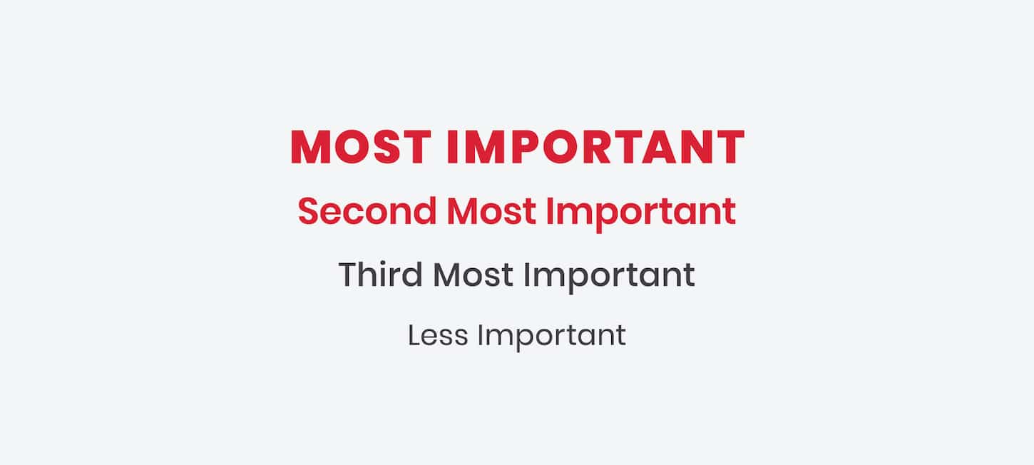
- Use Thoughtful Typography. A bad font can ruin a great design. Choose a clean, easy-to-read font, and use size, color, and weight to create a clear visual hierarchy. Your headline should be big and bold; your body text should be legible.
- Prioritize Mobile, Period. If your page isn’t perfect on a phone, you’re losing money. Simple as that. A significant portion of your traffic is on a mobile device, so your page must load quickly and be easy to navigate with a thumb.
- Feature Reviews and Testimonials. Displaying reviews from past clients and partners acts as “social proof.” It’s not just you saying you’re great; it’s a real person vouching for you.
- Showcase Your Credibility. This is where you get to brag a little. Establish your brand’s credibility by displaying trust symbols like awards, accolades, and case studies.
- Include a Contact Form. This is the most important part of the page. Without leads, what’s the point? Avoid asking for unnecessary information that could deter a user.
- Be a Real Person. Include your company’s name, address, and phone number. The more information you feel comfortable providing, the better. This way, you build trust with your audience and capture any possible phone calls or email conversions.
- Incorporate Promotions. If you have special deals in rotation, feature them prominently as a pop-up! These act as calls to action and instill a sense of urgency in your users.
Pro Tip
Freebie Tip #16: The SEO Essentials: How to Get Seen
You can have the prettiest real estate landing page in the world, but if no one can find it, it’s just a digital ghost. A great landing page works hand-in-hand with SEO to attract organic traffic.
- Content Length: When it comes to search rankings, a longer, more comprehensive page tells Google that you’re an authority. Aim for enough content to fully cover the topic and satisfy your users’ curiosity, without adding unnecessary fluff.
- Keyword Placement: Don’t just throw your keywords in there. Use your primary keyword (like “real estate landing page“) in your title, your H1, your first paragraph, a few H2s organically, and a few times throughout the body. Don’t go overboard—natural, conversational language wins every time.
- Master Local SEO: For real estate, local is everything. Make sure your landing page is optimized for your specific service area. Use city names, neighborhoods, and local landmarks in your copy. Build trust and authority by including links to local resources or community pages.
- Proper Header Hierarchy: Your page’s headings (H1, H2, H3, etc.) are like an outline for both Google and your users. Your H1 should be the title of your page, and your H2s should be the main sections. Use them to create a logical, scannable structure.
How to Use UX as a Marketing Strategy
Implementing these tips into your real estate landing page and overall website structure isn’t just a design chore—it’s a strategic advantage. It helps you build more interactive relationships with clients and set your company apart from the competition. All people really want when functioning online is a clear, simple process to collect the information they’re after. By putting yourself in your consumer’s shoes, you can keep the user interface and website flow at the forefront of your strategy.
We Know Eggsactly How to Help
From professional copywriting to bespoke web design, Red Egg Marketing can help you develop a strategy to attract more clients and increase brand loyalty. We’re all about making your life easier—which is, after all, the entire point of a great user experience. Contact us today.
