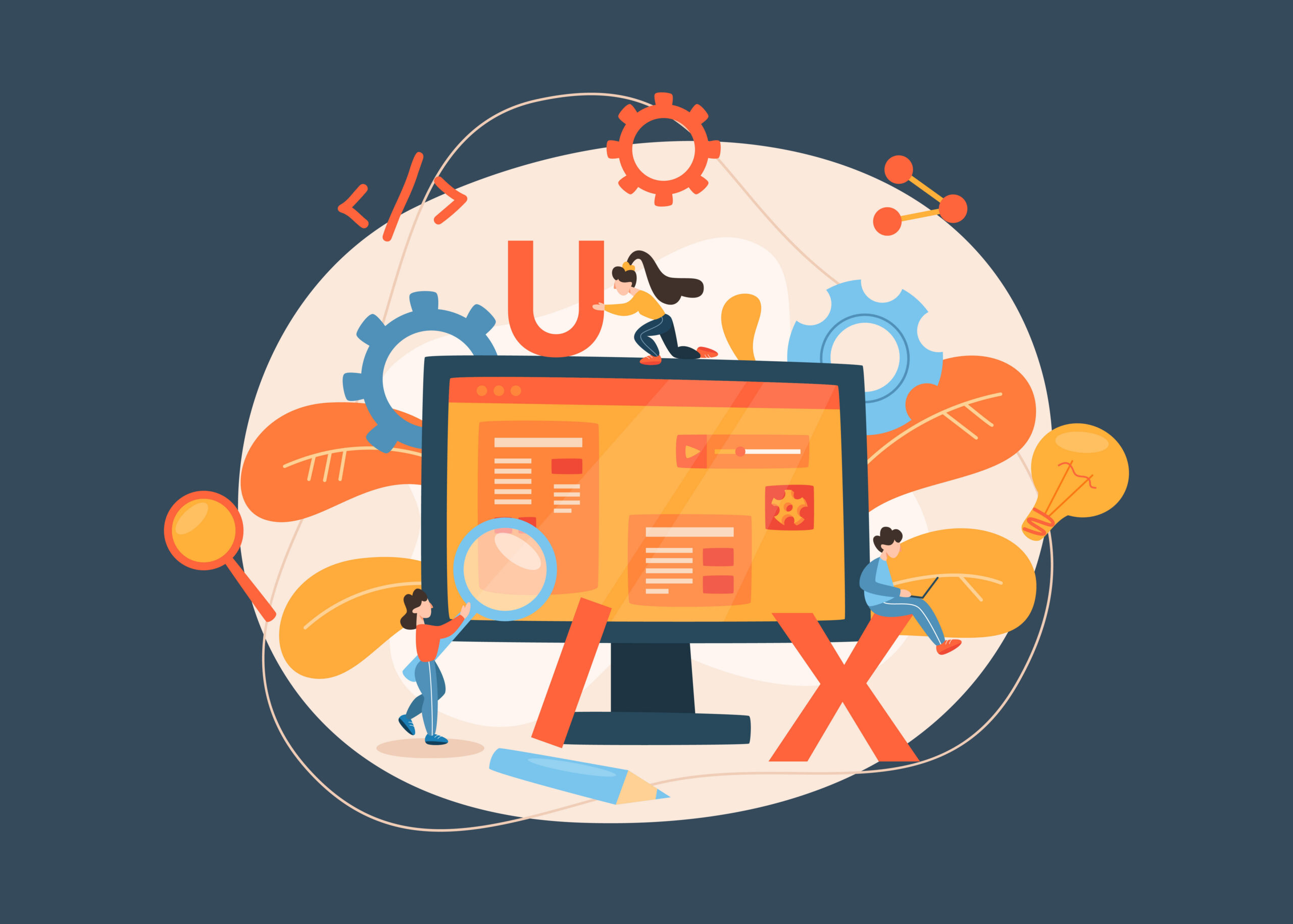
The Egg’s Guide to User Experience Website Design Tips
A good-looking website can grab attention, but a strong user experience is what keeps people and AI agents from bouncing the second they get annoyed. When your site is easy to navigate, quick to load, and simple to understand, visitors are much more likely to stick around and take action. That is why user experience matters just as much as design. Because pretty only gets you so far.
In this guide, we’ll share some insider user experience website design tips that help businesses create websites that feel intuitive, build trust, and support conversions. These are the practical improvements that can make a real difference in how your site performs, without making your visitors work way too hard for basic information.
What “User Experience” Actually Means (And Why It’s Not Just “Vibes”)
Many of us have come across websites that take way too long to load, have confusing buttons, or are poorly organized. Or have you ever clicked a link, only for an image to load instantly and push the link out of view? Or clicked a “More Info” link that offers no actual details? These frustrating issues can be extremely annoying and may drive visitors away, reducing your conversions.
User experience (or “UX”) goes beyond visual appearance. Some of the most beautiful websites can struggle with UX when assets are too large, or unorganized pages make it difficult to find the information your visitors are looking for. Designing a good website is all about anticipating your site visitors’ needs and solving them accordingly. With some of our user experience website design tips, you too can prevent another flipped table from a disgruntled site visitor.
8 Core User Experience Website Design Tips That Move the Needle
A few smart user experience website design tips can do a lot of heavy lifting for your website. Good UX is not about cramming in flashy features and hoping people are impressed. It is about making your site feel polished, intentional, and easy to move through without all the unnecessary drama. These are our top eight.
1.) Crack Open Better Navigation (So Obvious It’s Almost Boring)
Believe it or not, new site visitors don’t know the layout of your site like you do. If the link to your Services page is labeled “Learn More”, it’ll take more time to find information about your services, and visitors may just give up entirely. Navigation labels should be short and descriptive (e.g., “Contact”, “About”, “Products”).
In a similar vein, you don’t need 20 links in your navigation. No matter how well-labeled they are, too many page links can be overwhelming and make a site impossible to sift through.
Good navigation should feel effortless. When someone lands on your website, they should immediately know where to go next without having to stop and think. If visitors have to hover over multiple menus, decode vague labels, or click around just to find basic information, something’s gone wrong.
Improving your navigation is one of the easiest user experience website design tips to start with. When visitors can quickly find what they’re looking for, they’re far more likely to stick around and far less likely to flip the proverbial table.
2.) Fix the Mobile Experience First (Because That’s Where People Are)
Be honest: how often do you browse a website on your computer versus your phone? For most people, the answer is obvious. Whether they’re searching for a business, comparing products, or quickly looking up information, they’re doing it from a phone while sitting on the couch, waiting in line, or pretending to pay attention in a meeting.
A website that looks great on desktop but falls apart on mobile is one of the quickest ways to lose visitors. When users have to pinch, zoom, and wrestle with a page just to read it, they usually won’t stick around.
For good mobile UX, consider what mobile users are trying to accomplish. Often, they’re looking for quick answers: your services, pricing, location, or contact information. Making key details easy to find can dramatically improve engagement. Content should stack cleanly, text should be easy to read without zooming, and buttons should be large enough for actual human thumbs.
3.) Speed Is UX (And Yes, People Will Leave)
Life moves fast, and your website should keep up. If your website takes more than a couple of seconds to load, visitors AND AI agents will bounce. Slow load times create instant frustration, and frustrated visitors rarely convert into customers.
A few common issues tend to be responsible for sluggish sites: oversized images, unnecessary plugins, bloated scripts, and cheap hosting. The good news is that most of these are fixable. Compress images before uploading them. Limit the number of plugins you install. Keep scripts lean and purposeful. A faster website improves performance and the user experience. When users don’t have to wait around staring at a loading screen, they’re far more likely to stick around.
The TL;DR on this user experience website design tip: fast sites win.
4.) Write Like a Human, Not a Brochure
Corporate-speak is one of the quickest ways to lose a reader. Phrases like “cutting-edge synergistic solutions” may sound impressive to your boss, but they’re exhausting to read on a website. Site visitors don’t want to be impressed by your advanced, complicated vocabulary; they want quick, clear answers.
Good UX writing is simple, conversational, and direct. It guides users toward the next step without forcing them to sift through paragraphs of marketing fluff.
Instead of:
“Our organization leverages innovative strategies to optimize digital engagement.”
Try:
“We help businesses build websites that actually convert visitors into customers.”
Clear, human language helps visitors understand your value quickly, which is especially important for service-based businesses. For example, web design for accountants or finance often benefits from straightforward messaging that clearly explains services, expertise, and next steps.
5.) Use Visual Hierarchy Like You Mean It
When someone lands on your website, they’re not gearing up to read a novel. They scan.
That means your layout should guide their eyes toward the most important information first. Headlines should stand out. Subheadings should organize content. Buttons should look like buttons, not floating text hiding in plain sight.
Visual hierarchy is created through a combination of size, spacing, color, and placement. The goal is to make it immediately obvious:
- What the page is about
- What action should the user take
- Where to find supporting information
When done well, visitors instinctively know where to look next. When done poorly, the page feels chaotic and confusing. A good web marketing graphic designer will prioritize visual hierarchy to improve the user experience.
6.) Make Trust Signals Impossible to Miss
People are naturally skeptical online (for good reason). Before they share their email, schedule a call, donate, or make a purchase, they want reassurance that your business is legitimate. That’s where “trust signals” come in.
These can include customer testimonials, client logos, case studies, industry certifications, reviews, or recognizable partners. Even small details (e.g., a clearly displayed phone number or physical address) can build credibility.
The mistake many websites make is hiding these elements deep inside a page. Instead, bring them forward. Feature testimonials near conversion points. Highlight recognizable brands you’ve worked with. Show real results when possible.
Web design for nonprofits and rescues especially benefits from trust signals that make visitors more willing to donate their time and money. Trust reduces hesitation, and less hesitation means more conversions.
7.) Forms Shouldn’t Feel Like a Punishment
You know the feeling.
You click “Contact Us,” expecting a quick form, and instead you’re greeted with 17 required fields, three dropdown menus, and a captcha puzzle that feels like a final exam you definitely didn’t study for.
At that point, most visitors will just close the tab. Forms should be quick and painless. Ask only for the information you TRULY need to start the conversation. In many cases, a name, an email address, and a short message are enough. You can always gather more details later. The fewer hoops users have to jump through, the more likely they are to complete the form.
8.) Accessibility Isn’t Optional (It’s Good UX)
Accessibility sometimes gets treated like a technical checklist, but at its core, it’s about making your website usable for more people. That includes visitors with visual impairments, mobility limitations, or cognitive differences. Simple design choices like strong color contrast, readable font sizes, descriptive alt text for images, and keyboard-friendly navigation can make a huge difference.
Accessibility also improves usability for everyone. Clearer text, better contrast, and logical navigation structures benefit all visitors, not just those using assistive technology.
Good accessibility is good UX.
Quick UX Gut-Check: Does Your Website Pass the “First 10 Seconds” Test?
Here’s a quick exercise:
Open your website in a new browser window and pretend you’ve never seen it before. Within the first 10 seconds, can a visitor easily answer these questions?
- What does this company do?
- Who is this for?
- What should I do next?
If those answers aren’t obvious, there’s a good chance you need an update in your UX. Many of the best user experience website design tips boil down to this idea: clarity beats cleverness. A visitor should never have to “figure out” your website.
Common UX Mistakes We See All the Time
Even well-designed websites can stumble into a few common traps. Some of the biggest offenders include:
- Navigation menus with too many options
- Walls of text with no headings or spacing
- Buttons that don’t look clickable
- Bulky popups that lag a site
- Pages that look great on desktop but break on mobile
None of these issues are catastrophic on their own but when several appear together, they create a frustrating experience that drives users away. These mistakes show up in nearly every industry, from ecommerce brands to financial institutions. For example credit union website design needs to balance usability, trust, and clear membership pathways.
The good news is that most UX problems are fixable with a few thoughtful improvements.
Use Our User Experience Website Design Tips & Make Your Website a Little More Egg-cellent
A better website experience does not need to be dramatic. It just needs to make sense. When your site feels clear, polished, and easy to use, visitors are much more likely to stick around and convert. These user experience website design tips are meant to help you cut through the noise and focus on what actually improves performance.
And if your current strategy is basically “let’s change a few things and see what happens,” we should talk. Our UX expert can help you stop spinning your wheels and start making decisions that move your website in the right direction. Which, if you ask us, is a pretty egg-cellent outcome.
