

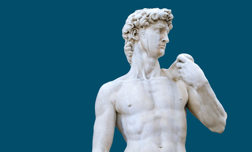
Museums allow us to encounter towering dinosaur skeletons, glittering gemstones, and paintings that come alive with color. Your museum website design should help capture that magic for potential visitors deciding if they want to visit. Whether you’re the world-renowned Van Gogh Museum in Amsterdam, the Field Museum in Chicago, or the Met in NYC, your digital presence should feel like an extension of the experience you offer inside your walls: inspiring, inviting, stunning, and unforgettable.
What Good Museum Website Design Can Do
Museum website design is the art (yes, art!) of building a digital space that both informs and excites. A well-designed museum website balances aesthetics and function: it tells your story, showcases your collections, offers easy navigation, and makes the virtual experience nearly as captivating as the real one.
7 Museum Website Design Tips You Should Steal
From effortless navigation to fast-loading visuals, small design choices can make a huge difference in how people experience your museum online. Below are seven practical, steal-worthy tips to help your website capture the same wonder as your galleries, while making it easier for visitors to plan their trip, and for search engines to help them find you in the first place.
1. Use Storytelling That Matches the Collection
Your museum has a story, and your website is your chance to tell it with intention. Whether you’re curating centuries of history or showcasing new voices, your website needs to tell that story honestly and compellingly. Visitors want to know what makes your museum different. Beautifully written, on-brand copy reflecting your museum’s unique exhibits and values makes for an impactful introduction for readers, which ultimately drives bookings.
2. Make Navigation Easy Breezy
No one wants to pull their hair out over trying to purchase admission. We recommend reading our user experience website design tips to see why smooth web interactions are always of utmost importance. In short, effective websites remove the friction between interest and action. Think about the most important actions you want website visitors to take and make navigating there as clear as possible. If your website makes it easy to check what’s on view, buy tickets, and plan a route, then visitors are far more likely to show up.
3. Use Visuals That Look Good and Load Fast
Visuals are kind of a big deal in a museum. They also matter a lot for your digital presence, too. Crisp photography of your galleries, close-up shots of standout pieces, and short video clips of exhibits in motion all help translate the feeling of being there into something people can sense through a screen.
But stunning visuals only work if people actually stick around to see them. If a hero image takes five seconds to load, most visitors won’t wait for it. That’s why balancing visual quality with site speed is so important. The goal is simple: visuals that feel as rich and immersive as walking through the galleries themselves, without making people wait to get there.
4. Optimize Images Without Losing the Wow Factor
Everyone wants to catch and keep their visitors’ attention when they visit their website.
Slow-loading websites are the kiss of death if you want that to happen.
Compressing images without sacrificing detail, using modern image file formats like WebP, and leveraging lazy loading (so images load as visitors scroll rather than all at once) can dramatically improve load times without dulling the “wow factor.” Compressing images too much might make your site speedy, but your images will look pixelated and unappealing. Responsible management of your website media and image compression plugins can help strike this balance.
5. Build In Accessibility from Day One
Your exhibits should be designed to educate and inspire everyone, so your website should reflect that mission, too. Accessible museum website design means building a site where visitors with visual, auditory, motor, or cognitive disabilities can fully engage with your content. A few core elements make this possible:
- Screen reader compatibility: Descriptive alt text and clean, semantic HTML allow visitors using screen readers to understand your collection pages, exhibit descriptions, and navigation without missing key information.
- Keyboard navigation: Some visitors can’t use a mouse or trackpad, so every button, menu, and form (including your ticketing checkout) needs to work smoothly with keyboard-only controls.
- Color contrast: Text and buttons should remain legible against their backgrounds, so visitors with low vision or color blindness can read your content without straining.
- Clear Language: Straightforward wording, free of unnecessary jargon, makes your site easier to process for visitors with cognitive disabilities, and it tends to read better for everyone else, too.
Remember, making your site accessible also expands your audience, as roughly 1 in 4 adults in the U.S. live with some form of disability.
Accessibility options are often legally required, too. Many museums, especially those receiving public funding or operating in certain states, are subject to accessibility laws like the ADA. Non-compliant sites can face legal complaints or lawsuits. Rather than cobbling together accessible web options after your site is already up and running, consider accessibility from the planning stage.
6. Make Tickets, Hours, and Donations Easy to Find
If someone can’t find your hours within a few seconds of landing on your home page, your site’s just not doing its job. Harsh, we know, but it’s true!
You’ve gotta put practical information front and center. A persistent “Plan Your Visit” or “Tickets & Hours” button in the main navigation, visible on every page, ensures visitors never have to hunt for it. Donation prompts, like “Support Us” or “Become a Member,” deserve similar prominence. Museums that treat these functional elements as afterthoughts–tucked into footer menus or buried in dropdown submenus–are turning away the very visitors and donors they’re trying to reach.
7. Structure Your Site So Search Engines Can Find It
Search engines can only recommend your museum if they can understand what’s on your site, and that starts with clean, logical structure. This is why Search Engine Optimization is so important. A well-structured site helps both visitors and search engine crawlers navigate your content with ease. Keep these fundamentals in mind:
- Descriptive page titles and headers: Clear, specific wording tells visitors and search engines exactly what each page covers.
- A logical content hierarchy: Organizing your pages in a sensible order makes it easy to find exhibits, hours, and ticketing information.
- Unique meta descriptions and title tags: Every page should have its own, rather than duplicating the same text sitewide.
- Descriptive alt text on images: Alt text should describe what’s pictured, which helps both accessibility and search visibility.
- A clean, readable URL structure: Simple, logical URLs are easier for visitors to trust and for search engines to index, rather than a string of random characters.
With Google’s March 2026 Core Update, there’s even more to consider. For example, Google now favors real images over stock photos. This is already ideal for your museum website design, as real photos help lend authenticity to the online experience. The update also flags overuse of AI writing as low-quality content and adds more weight to positive visitor reviews. A sitemap submitted to Google Search Console rounds this out, ensuring new exhibition pages and event listings get indexed quickly rather than languishing unseen for weeks.
Museum Website Mistakes That Crack Your Credibility
Small museum website design missteps can undermine the credibility you’ve worked hard to build. A clunky ticketing system, an un-responsive layout, or a cluttered homepage all send the same message: this institution isn’t paying attention to detail. Individually, these issues might seem minor. Together, they chip away at the trust and professionalism your museum depends on to draw people through the door. An experienced Denver web development agency will anticipate these issues and make a plan from the early development stages to address them effectively. Partner with experienced web professionals to avoid the blunders that follow.
An Outdated Ticketing System
A ticketing system tends to be where a museum’s website credibility goes to die. If visitors have to re-enter their information multiple times or get kicked back to square one after a payment error, they’ll consider abandoning the purchase altogether. Worse, an outdated system often can’t handle basics that visitors now expect, like timed entries, mobile wallet payments, or confirmation emails. Modernizing your ticketing is a significant trust signal. A smooth checkout that works as well on a phone as it does on a desktop tells visitors that the museum values their time. Of course, it’s vital that visitors feel secure when it comes to spending their money.
Building a Website Just for Desktops
Most museum visitors are checking your site from their phones to look up hours on the way over, compare ticket prices while standing in line, or pull up a map from the parking lot. When a website is designed with only desktop screens in mind, all of that breaks down. What looks polished on a laptop can become nearly unusable on a phone, and visitors won’t blame their device. They’ll blame the museum.
A responsive design that adapts fluidly to any screen size isn’t an optional upgrade anymore. If your website doesn’t work beautifully on phones and tablets, you’re losing huge chunks of your audience. Responsive museum website design on every landing page ensures that every visitor, no matter their device, has a seamless, satisfying experience.
Cluttered Layouts with No Visual Hierarchy
A cluttered layout forces people to work to find what they need, and most won’t bother. Without a clear visual hierarchy guiding the eye from the most important information down to the details, even genuinely great content about a museum’s collection or upcoming exhibitions gets lost in the noise.
Good hierarchy is really about restraint: generous white space, one clear focal point per page, and a deliberate order to headlines, images, and buttons that guides visitors naturally toward the action you want them to take. Websites that pack every inch of a page with text, graphics, and links out of a desire to say everything at once often end up saying nothing clearly at all.
Fonts and Colors That Clash with the Museum’s Brand
A stately historical museum using a playful, rounded typeface will feel dissonant with its subject matter; a contemporary art museum defaulting to generic corporate blue-and-gray reads as safe and forgettable when it should feel bold. When the visual language of the website doesn’t match the visual language of the institution, visitors pick up on the disconnect even if they can’t name exactly why something feels off.
This mismatch often creeps in through inconsistency rather than one bad decision, like branding that was updated in the museum’s print materials but never made it to the website. Getting this right doesn’t require a dramatic redesign. It requires discipline, using the same typefaces, colors, and visual tone across every touchpoint so the website feels like a natural extension of the museum itself, not an afterthought.
Stock Photos That Don’t Match the Collection
Nothing undercuts a museum’s credibility faster than generic stock photos of art that has no connection to what’s on view.
It’s a disconnect that’s especially jarring for museums with distinctive collections or architecture, where the whole point of visiting is to see something you can’t see anywhere else. Investing in quality photography of the actual collection and building isn’t just a branding nicety; it’s one of the most direct ways to show visitors what they’re actually walking into, before they ever buy a ticket. Beyond that, as mentioned above, stock photography can have a negative impact on SEO performance, so it should be used in moderation.
Pop Ups and Auto Play That Get in the Way
When a website visitor is immediately blocked by a newsletter signup pop-up, a donation ask, or a noisy video, they are actively blocked from the information they really came for. A better approach is patience: let pop-ups trigger based on intent, like exit-intent or after meaningful scroll depth, and let video content be something visitors choose to play rather than something forced on them. A website that respects a visitor’s autonomy from the first click builds exactly the kind of goodwill a museum needs to turn a browser into a ticket buyer.
Where Red Egg Comes In
As you can see, there is no shortage of major features to consider in your museum website design. It can be a lot to remember, but there’s no need to feel discouraged! At Red Egg Marketing, we understand that museums need more than a beautiful website — they need an online presence that draws visitors, builds community, and supports long-term growth. With years of experience helping cultural institutions succeed digitally, our team knows how to craft branding, web design, and marketing strategies that honor your mission while driving results. Meet our Denver web developers and get to know some of the eggs you would collaborate with to bring your amazing new website to life.
Give Your Museum a Website You’ll Want to Brag About
Your museum has a story worth sharing — let’s make sure it gets seen! We build websites that are thoughtful, functional, and tailored to the people who care about what you do.
If you’re ready to bring your digital presence up to par with your in-person experience, we’re here to help. Learn more about our marketing services, and let’s work together on creating a museum website that’s as stunning as your museum is.